
Did Bitcoin Bottom? The Positive Case — And The Negative Case.
Story by: John Navin
After Bitcoin peaked in July, investors began unloading and it’s been steadily downward ever since. From 14,000 to 6600, that’s quite a drop in a short time for such a widely-followed investment vehicle: more than 50% is not for widows and orphans.
A couple of technical indicators suggest that with this week’s price action, things may have changed, emphasis on the “may have,” for the highly speculative and quite volatile cryptocurrency.
Here’s the daily price chart:
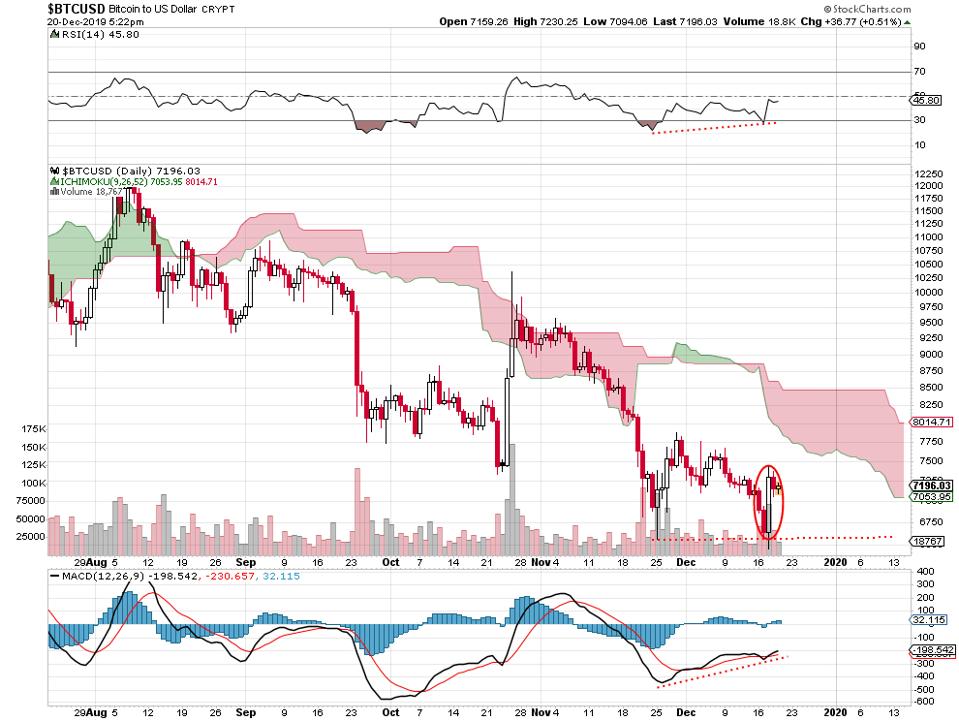
Bitcoin daily price chart, 12 20 19.
STOCKCHARTS.COM
The main thing is the big fat bullish engulfing candlestick on Wednesday — I’ve circled it in red. Price dropped below the November low initially and then buyers came in to take out the high price of the previous session. A bullish engulfing candlestick isn’t always perfectly predictive, but it’s obvious that, at least temporarily, buyers have taken the upper hand.
The reason it may mean something this time is the positive divergence apparent on the technical indicators for relative strength and for the relationship of moving averages. You can see how the RSI, above the price chart, comes in with a slightly higher low from the November low price to the lower mid-December low.
PROMOTED
You can also see the similar pattern of the moving average convergence divergence indicator below the price chart. The MACD is trending upward again even with this month’s lower price.
It would be foolish to take any one of these indicators by themselves to be somehow predictive of future price. That all 3 of them — the bullish engulfing candlestick, the RSI and the MACD — are lined up favorably suggests the possibility of a reversal for the cryptocurrency.
Here’s the problem: the other major cryptos that typically follow Bitcoin’s basic trading pattern are not reflecting the same kind of strength. So, the type of price action is a non-confirmation, so far anyway.
Here’s the Litecoin daily price chart:
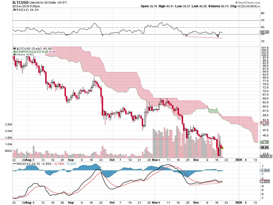
Litecoin daily price chart, 12 20 19.
STOCKCHARTS.COM
The bounce off the mid-December low has failed to make it back above the November low at just below 45.. The RSI indicator shows lack of strength. These are significant divergences from the Bitcoin price chart.
It’s the same problem with the Ethereum chart:
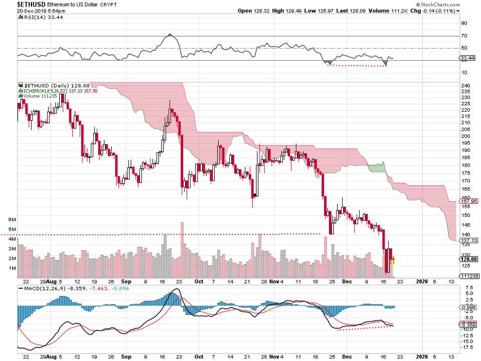
Ethereum daily price chart, 12 20 19.
STOCKCHARTS.COM
Unlike Bitcoin, this one failed to make it back above the November low. Like Litecoin, the relative strength indicator suggests weakening.
It’s similar to analyzing precious metals charts. When gold rallies a bit and silver fails to rally with it, you’re getting a failure to confirm in the price strength of the overall sector. Same thing going on here (in a way) with the popular cryptocurrencies.
It was a good week for Bitcoin and it’s unconfirmed by the action in Litecoin and Ethereum.
Original story: https://tinyurl.com/thqrtd9