
HODL Waves: What We Can Learn From UTXO History
By Mitch Klee
HODL Waves have been around for a few years but are still relatively new. They were first introduced in an article by Dhruv Bansal at Unchained Capital, a bitcoin-native financial services company. The interesting part about having a transparent blockchain is you can see all sorts of insights within the data. In particular, price is just one granularity of bitcoin, i.e., what the free market will pay for the asset though buyers and sellers. By mixing data science with a transparent blockchain, you can find out much more from the market and look under the hood. This is not possible with the traditional markets that claim to be free and open. In particular, the Federal Reserve Board has never been truly audited in a transparent way, which leaves much to be desired.
Bitcoin was made transparent with an unspent transaction output (UTXO) accounting structure and is audited every ten minutes by every single contributor in the network (nodes). This is what makes it possible to see on-chain data and insights. This is what makes bitcoin such a powerful base layer.

HODL waves are built off of UTXO data. In very simple terms, there is a trail of breadcrumbs or “dust” that is left behind with each transaction. These dust UTXO particles have a date and timestamp on them that allows us to peer into the history of Bitcoin’s blockchain. Unchained Capital went more into detail on UTXOs here in their blog post. Today I will just focus on three different groups that show up in HODL waves.
Above, you can see that there are different colors. Each color shows the age of the UTXO groups. 10 years is the oldest, and 24 hours is the smallest. You can almost see the waves forming if you look at the peak of each cycle. Follow those up and to the right, and there you have the original HODL Wave.
Lost Coins
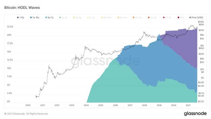
The first HODL wave group we can look at is the “lost coins”. These are coins that have been visibly inactive for 5-10 years. There have been a number of different analyses done that have come to an answer on lost coins, usually estimating that between 3-4 3 million to 4 million mined coins are lost. For context, Satoshi had an estimate of about 1 million bitcoin, all of which have never been moved, and are considered “lost.”
Both Unchained Capital and Chainalysis have done more precise measurements on the lost coins and have come out with at most 3.8 million coins lost. These estimates were done in 2018 and 2017 respectively, and have held up very well. Over time, we can assume there will be fewer and fewer coins being lost. As wallets and security get better and the technology matures, bitcoin will become considerably harder to lose.
Looking at the lost coins group above we can see that with about 18.5 million coins mined, 22% of them are between the age of 5 and 10 years. There are few changes in the group, but for the most part, they are untouched. That means currently, out of all coins mined about are 22% lost, possibly forever. This is very important to note, because not only is Bitcoin’s cap 21 million, but this number is also immutable. If someone loses their coins, they are gone forever. There are no bailouts or do-overs. This is also true with gold. If you were to lose all of your gold in a boating accident (oh no!) that is gone forever. This makes bitcoin even more scarce, and in turn more valuable.
Luckily, the ease of use for bitcoin is growing each day, and we are seeing more safe and secure ways to hold your keys. Between multi-sig, new wallets, estate solutions, and encrypted backups, bitcoin has become harder to lose. Not to mention the importance and dollar value is exponentially higher than it was in the early days, so of course most people are taking greater efforts to preserve their bitcoin long term, than in the early days. It’s not just magic internet money anymore.
Long-term Holders
The second group is the “long-term holders.” It is categorized by grouping UTXOs between six months and three years. This usually manifests between bull markets or quick rises in price on the lower-end time frame. This wave tends to show up after the bull market is over. These UTXOs seem to get drained as the bull market intensifies.
Although not perfect, you could use this as a tool to see where we are in the bull run. In relation to 2015-2017, there was one clear rise in long-term holders that peaked at the start of the bull run. Once the price started rising, long-term holders started selling. The low point was at the exact peak of the 2017 bubble.
In the 2012-2014 bull run, there was a short-term accumulation phase shown in the spike at the end of 2013. These waves are not predictors, but seem to be laggards and just a history book of what happened throughout the phase.
Short-term Holders
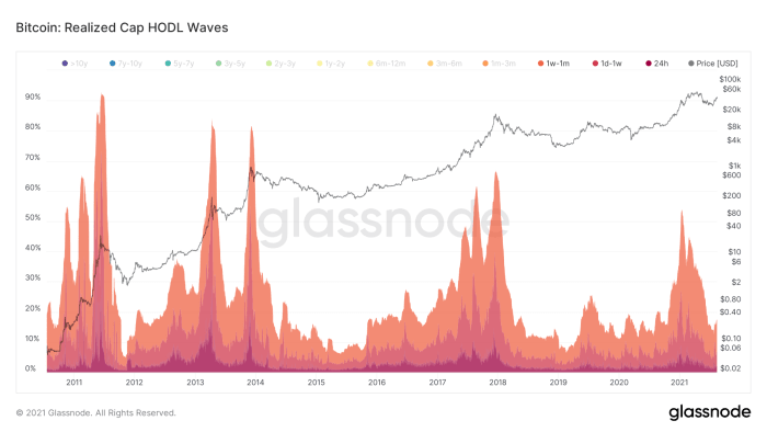
The third group is the “short-term holders.” They are grouped between the ages of one day and one month. These look to peak at huge price surges in bitcoins history. If you look carefully you can see three large price surges for each bull run. Currently, we are only on the first price surge. It looks like this could be retail coming in, and short-term speculators.
In 2012 we saw the first big price surge, which turned into consolidation, then a run-up. This repeated in 2016 but was a continual price surge that was more smooth landing in a single blow-off top rather than a double bubble. This short-term HODL wave will be interesting to watch in the coming months.
Visualizing Bull And Bear Markets
Putting them side by side you can see a clear distinction between when we were in a bull market and when we were in a bear market. The long-term holders give way to the short-term as price rises, eventually ending the bull market when there is no one left to buy. Since an increase in price is simply more buyers than sellers, this makes sense. I won’t make any price predictions here, but it seems that UTXOs and HODL waves are evolving or maturing. As wallet/security technology improves, and Layer 2 solutions mature, these UTXOs will start to look different. Bitcoin is evolving at a rapid pace, so this could be the last year we see these types of signatures in the blockchain.
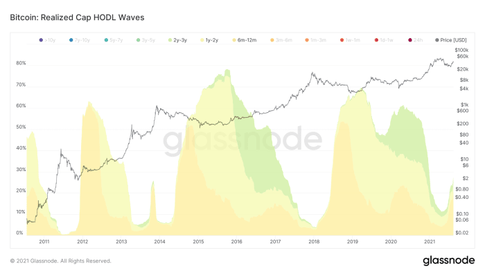
Realized HODL Ratio
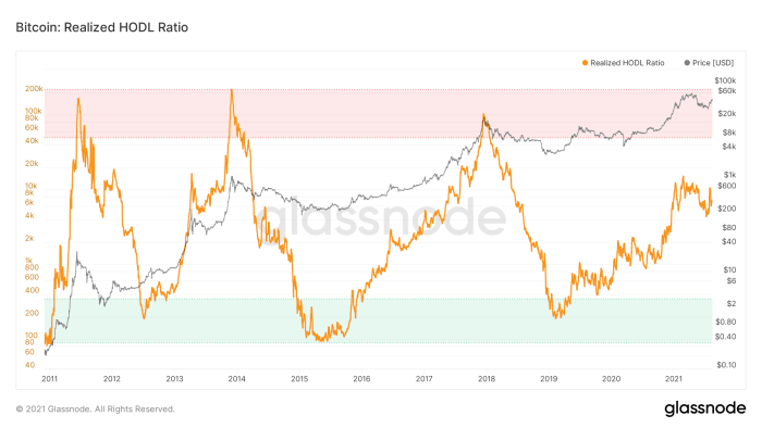
Finally, looking at the difference between long-term and short-term holders, you can come up with a ratio. Glassnode has made this visual and it seems to track the boom and bust cycles of the past pretty well.
“The Realized HODL Ratio is a market indicator that uses a ratio of the Realized Cap HODL Waves. In particular, the RHODL Ratio takes the ratio between the 1 week and the 1-2 years RCap HODL bands. In addition, it accounts for increased supply by weighting the ratio by the total market age. A high ratio is an indication of an overheated market and can be used to time cycle tops. This metric was created by Philip Swift.” – Glassnode
By this metric, the bull market is far from over and seems to be acting more similarly to the 2014 bull market. Although this is not a predictor of future success, we can infer something from this data.
On-chain data is still relatively new but it has given us many insights and will continue to show new and exciting things inside the Bitcoin blockchain. This is all possible because of the UTXO structure in the Bitcoin network and the transparent nature of its transactions. Ultimately Bitcoin will continue to evolve and mature, leaving different metrics behind as layers are built on top and transacting migrates from one layer to another. There is no way to tell what the future holds, but being able to watch the journey through data is more exciting than ever.
This is a guest post by Mitch Klee
Via Bitcoin magazine